QUARTZ

At a glance
- Role: Lead researcher
- Collaborator: Dr. JooYoung Seo (UIUC)
- Methods: Interviews, participatory co-design, qualitative analysis, RITE evaluation (8 BLV participants, 12 tasks, 4 visualization types)
- Tools and outputs: QUARTZ interface, multimodal representations, design guidelines
Summary
QUARTZ closes an accessibility gap in qualitative visualization workflows for blind and low-vision researchers. As lead researcher, I ran co-design and a RITE (Rapid Iterative Testing and Evaluation) study with 8 BLV researchers across 12 tasks and 4 visualization types, iterating the system between rounds so each research finding drove a concrete design change. The result: an open-source multimodal system and design guidelines built with, not just for, BLV researchers.
Project
My role: Lead researcher. Collaborator: Dr. JooYoung Seo, University of Illinois Urbana-Champaign. Scope: QUARTZ (Qualitative Understanding via Accessible Representation and VisualiZation) is an accessible, multimodal system that enables blind and low-vision (BLV) practitioners to create, explore, and analyze qualitative visualizations (e.g., knowledge graphs, concept maps, coding hierarchies) through complementary modalities. I led research and co-design with BLV practitioners and contributed to system design and evaluation.
Objective
While accessibility for quantitative charts has improved, qualitative data visualizations remain largely inaccessible to BLV researchers. These structures encode rich semantic relationships rather than numerical values, lack predictable grid layouts, and are built iteratively during analysis. Mainstream qualitative data analysis software (QDAS) such as NVivo relies on mouse-dependent interactions, produces visual-only outputs, and lacks screen reader compatibility. With approximately 2.2 billion people worldwide experiencing vision impairment, inaccessible tooling excludes qualified BLV analysts from consequential data work in business intelligence, AI development, and document analysis.
Research questions
- How can multimodal representations (structured text, sonification, interactive navigation, and AI-generated descriptions) effectively convey qualitative visualization semantics?
- How do these representations support analytical reasoning tasks such as pattern identification and theme development?
- What recommendations do BLV researchers make to enable accessible qualitative visualization authoring?
Work
QUARTZ integrates three multimodal representation strategies, each augmented by AI-assisted description generation:
- Structured textual descriptions, hierarchical, navigable text adapted from semantic levels in prior research.
- Sonification, mappings that encode network topology and inter-code relationships through pitch, rhythm, and spatial audio.
- Interactive navigation, keyboard-driven exploration of graph structures, with screen reader–compatible feedback.
AI-generated natural language summaries provide overviews and contextual descriptions with human-in-the-loop refinement. The system supports four core visualization types: network graphs, concept maps, Sankey diagrams, and coding-stripe annotated text.
Methods: Participatory co-design and user interviews with BLV practitioners; qualitative analysis and thematic coding; and a RITE evaluation with 8 BLV researchers spanning 12 tasks across all 4 supported visualization types (network graphs, concept maps, Sankey diagrams, and coding stripes). RITE is iterative by design: after each round I coded what broke down, changed the system, and re-tested with the next participants, so the evaluation itself is the record of research driving design decisions rather than a one-shot usability check.
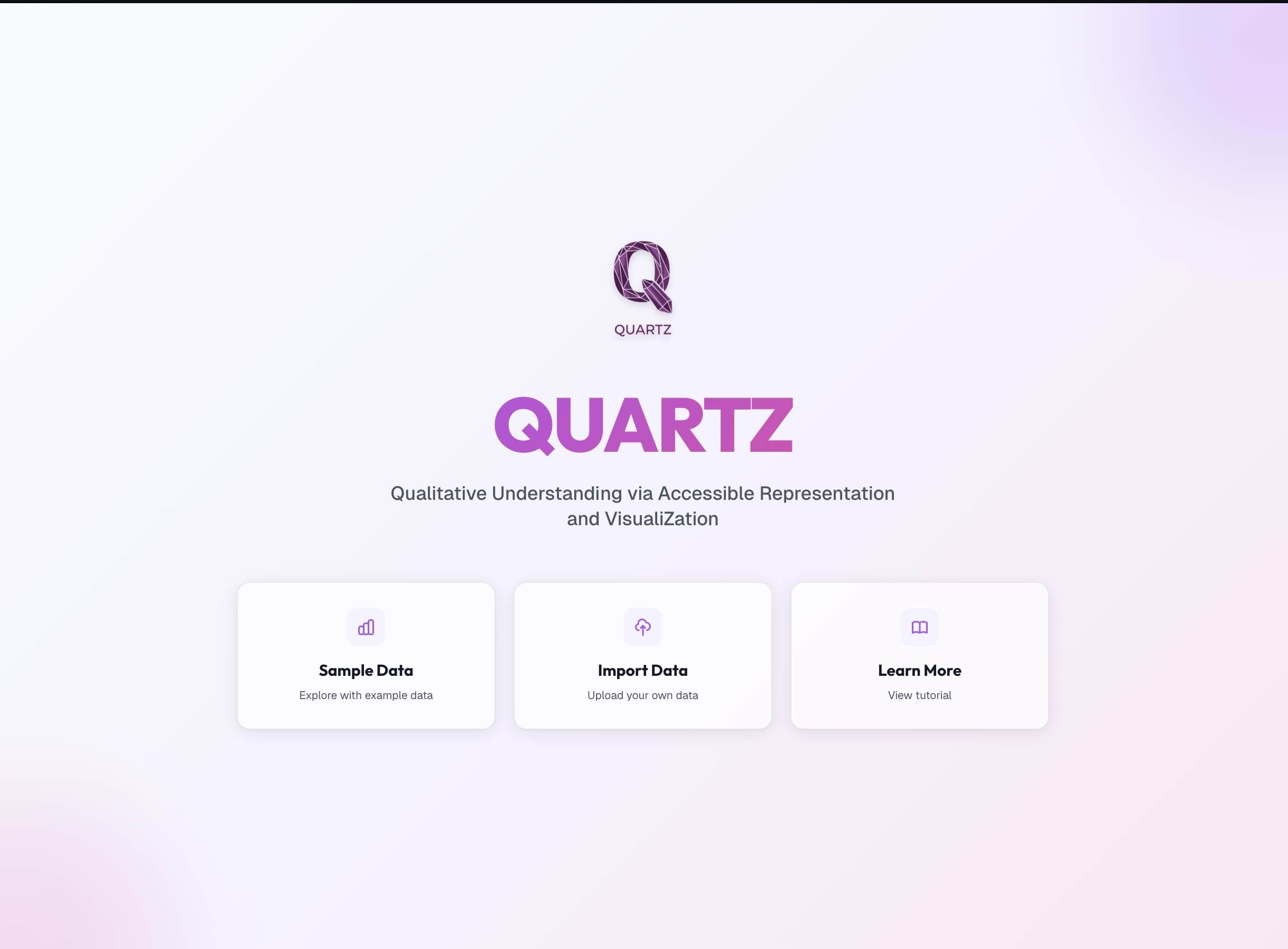
The QUARTZ landing page: users start from sample data, import their own, or learn more.
The four visualization types
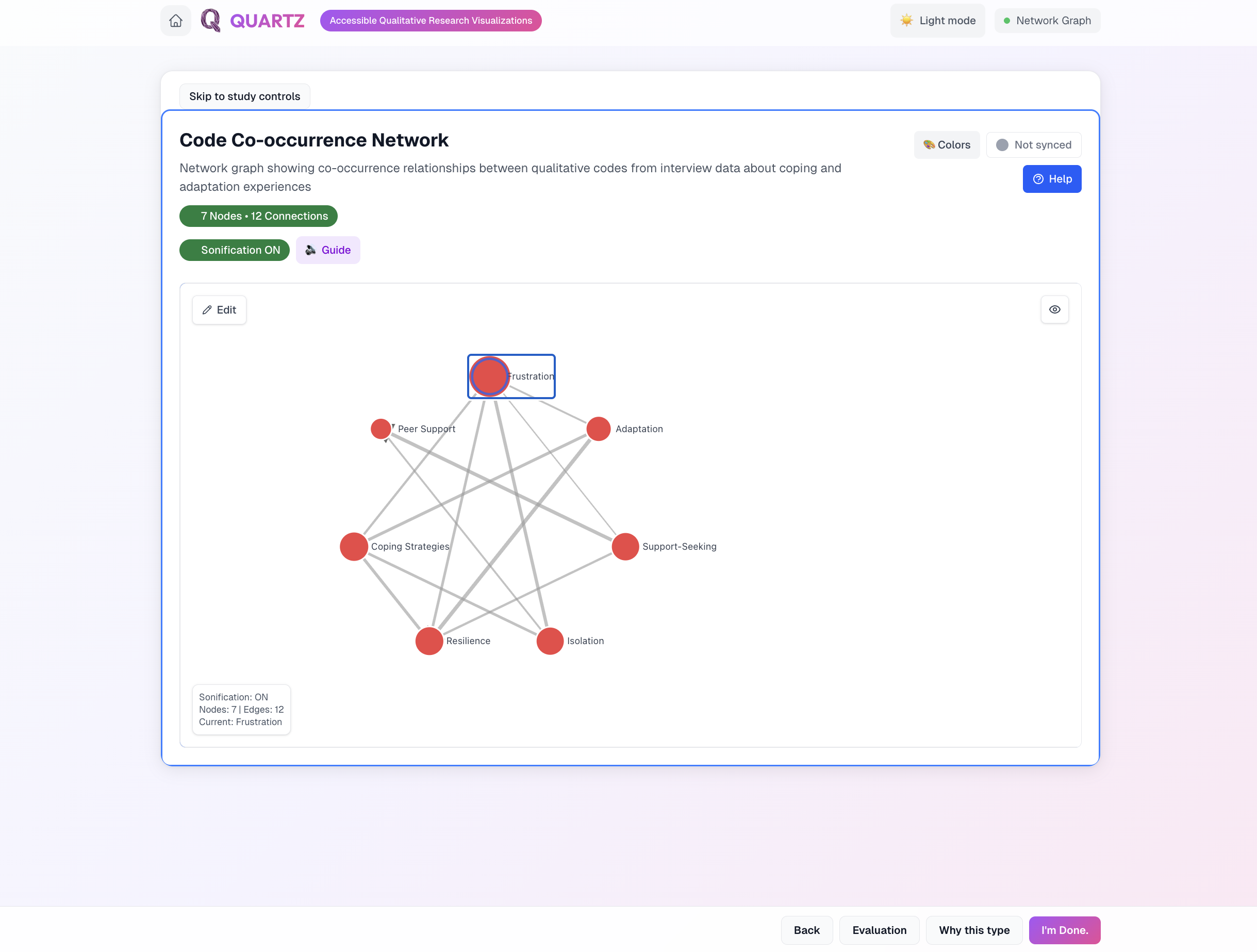
Network graph: code co-occurrence from interview data, with sonification and keyboard navigation.
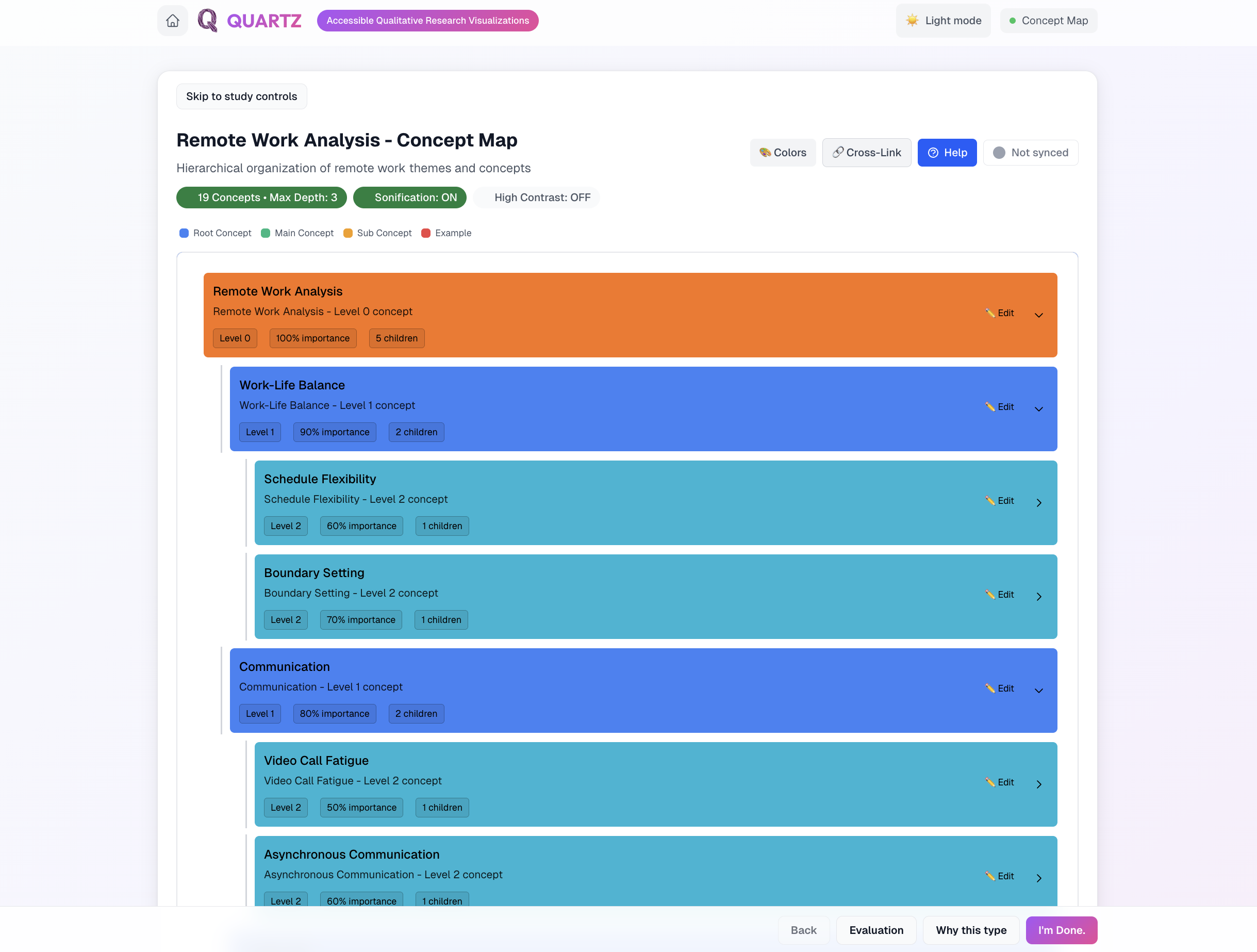
Concept map: a hierarchical view of themes and sub-themes.
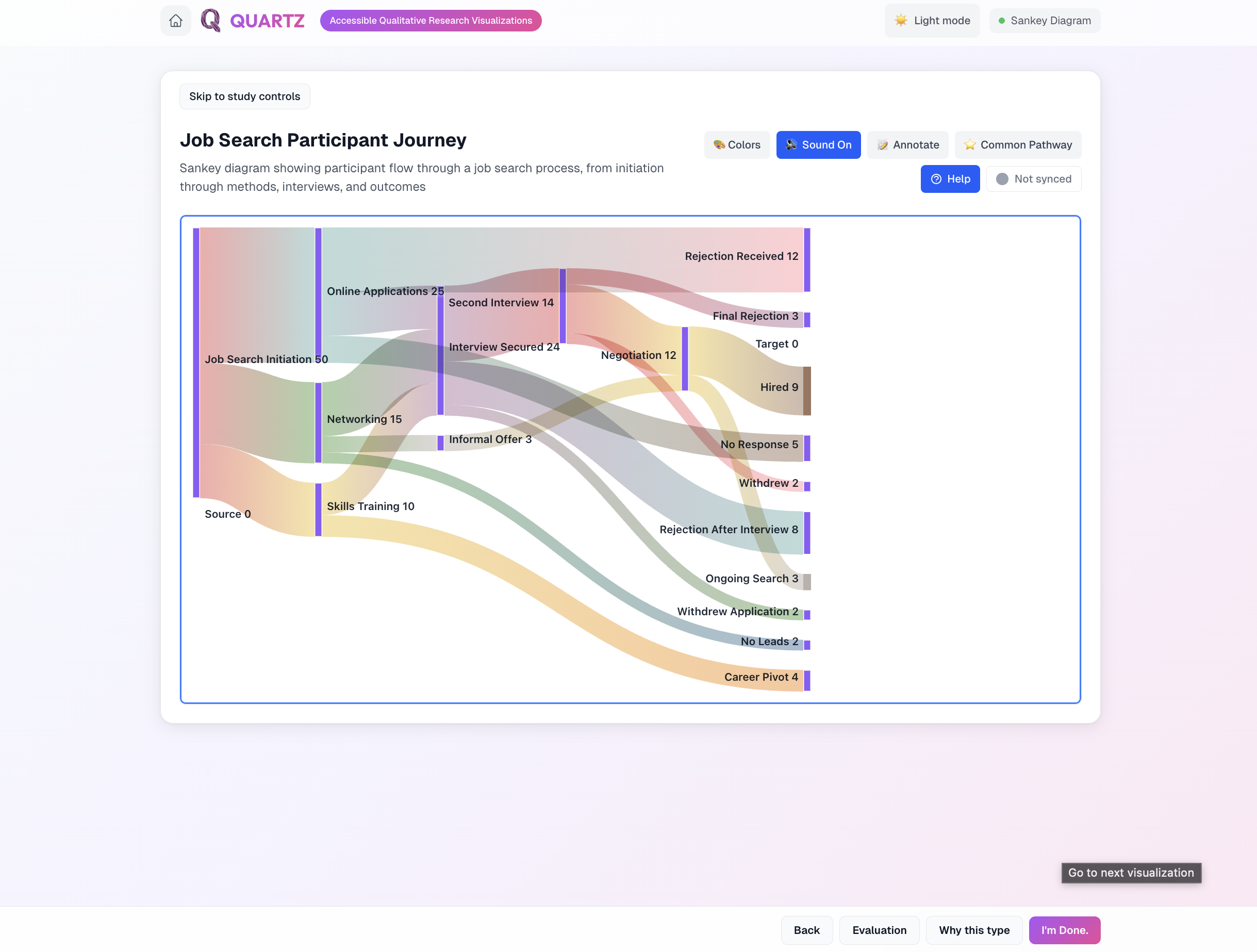
Sankey diagram: participant flow through a process, with audio.
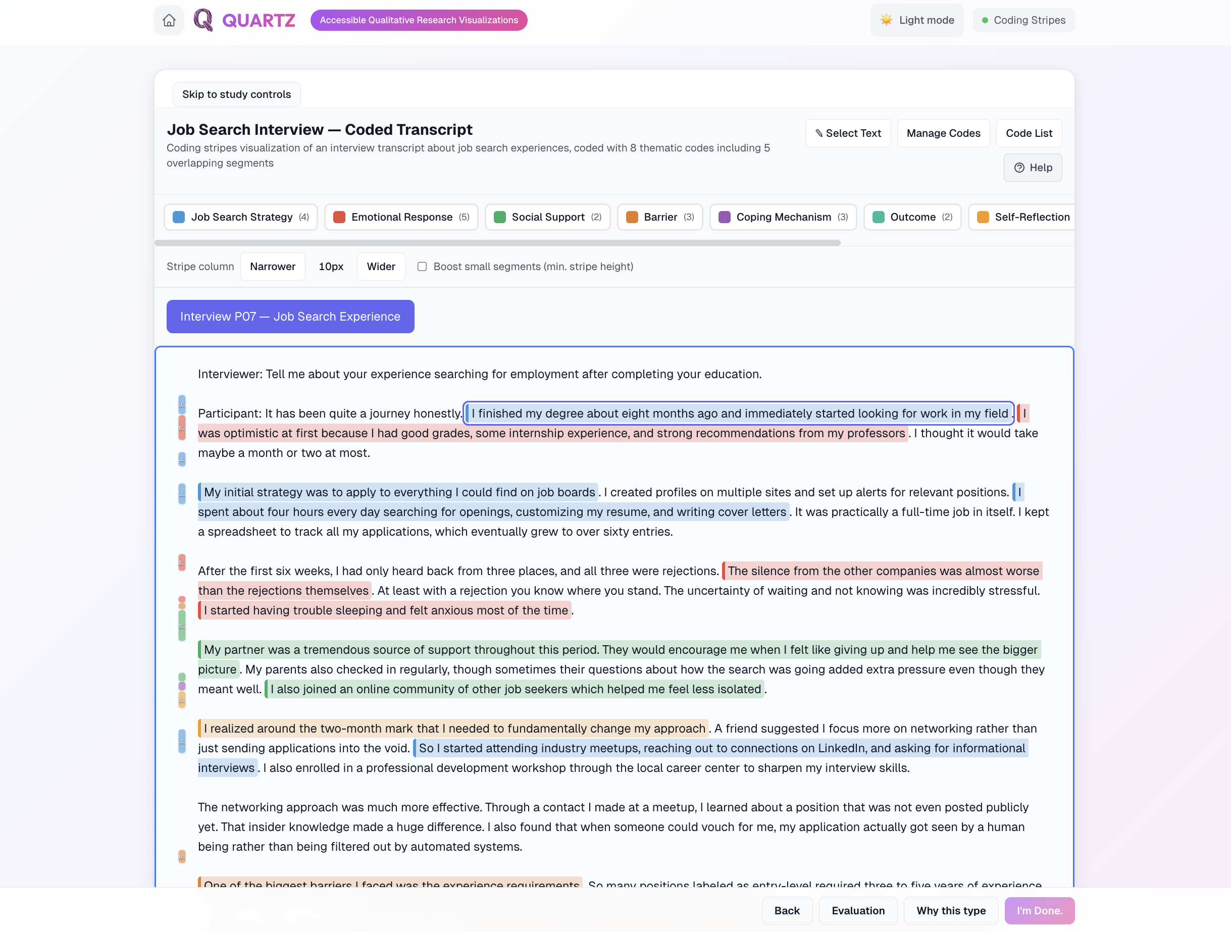
Coding stripes: overlapping thematic codes over an interview transcript.
AI-assisted guidance
QUARTZ inspects the shape of a user's data, recommends a fitting visualization type, and explains why — mapping each part of the data to a visual and auditory element and flagging complexity constraints.
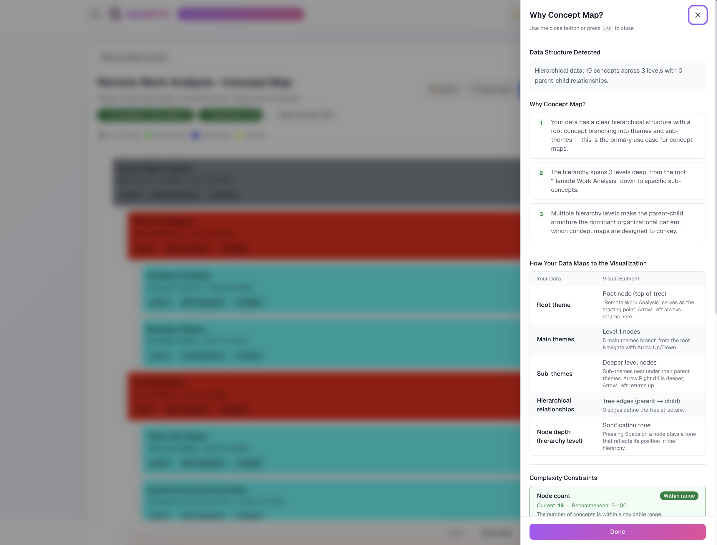
The guidance panel detects the data structure and explains the recommended visualization.
System design
I built QUARTZ as a Next.js application on a clean, layered architecture, treating accessibility concerns — sonification, focus management, and keyboard navigation — as first-class parts of the system rather than add-ons.
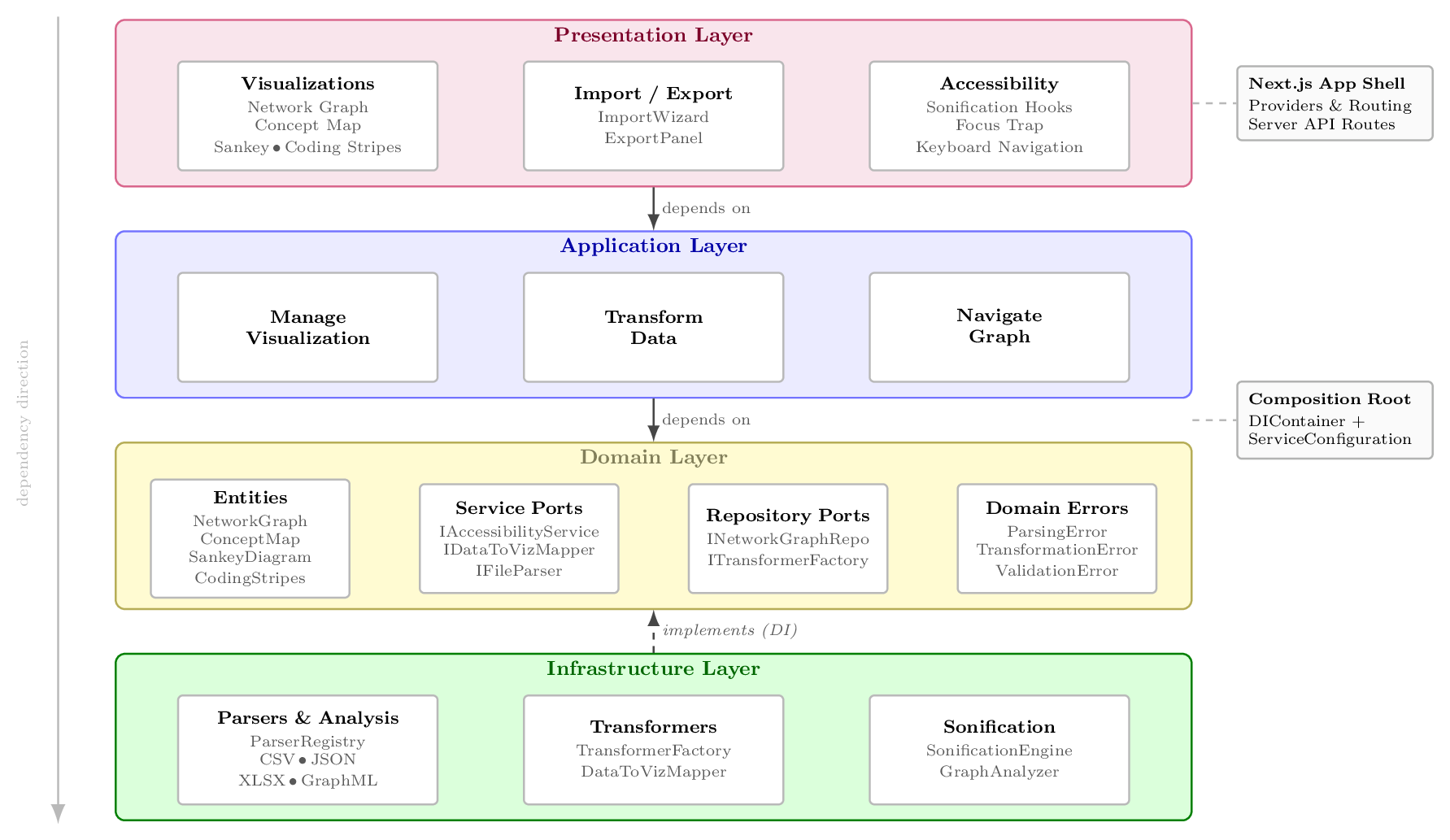
QUARTZ's four-layer architecture: presentation, application, domain, and infrastructure.
End result
How the research changed the design
Across the RITE rounds with 8 BLV researchers, findings from each round were translated into design changes before the next, so the study is a record of research driving iteration rather than a single usability score:
- Participants lost their place in large network graphs, so keyboard navigation was redesigned to announce position, neighbors, and depth on every move rather than reading nodes in a flat order.
- Early sonification mappings were ambiguous when several relationships overlapped, so pitch, rhythm, and spatial cues were re-scoped to encode topology one dimension at a time and made toggleable.
- Structured text descriptions were too verbose at the overview level, so they were reorganized into navigable semantic tiers (summary to detail) that researchers could drill into on demand.
- AI-generated summaries needed trust and correction, so a human-in-the-loop refinement step was added so researchers could verify and edit descriptions.
Outcomes
- An open-source multimodal system covering all 4 visualization types, shipped with the design changes above.
- Design guidelines for accessible multimodal representations of qualitative data structures, grounded in the RITE findings.
- Technical approaches for AI-assisted natural language description generation of relational data structures.
- A built-in evaluation view that scores publication readiness and runs structural quality checks on a visualization.
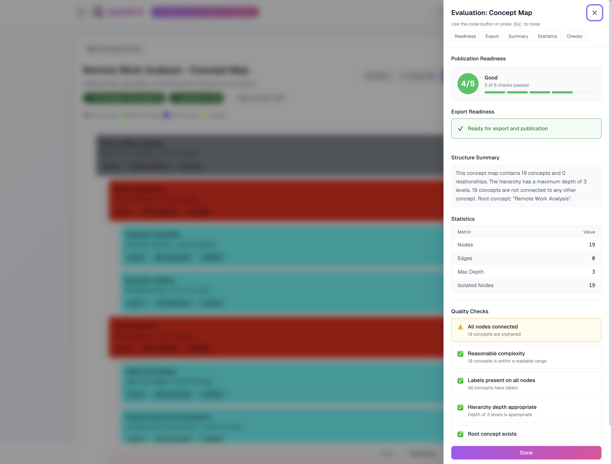
The evaluation panel reports publication readiness and structural quality checks.
Impact
The RITE study showed BLV researchers completing qualitative analysis tasks — pattern identification and theme development across network graphs, concept maps, Sankey diagrams, and coding-stripe transcripts — that mouse- and vision-dependent tools like NVivo had made impossible for them. Because qualitative methods increasingly feed business intelligence, policy analysis, and AI training-data curation, accessible tooling determines who gets to do this work; QUARTZ and its guidelines give teams a concrete, evidence-backed way to include BLV analysts.
Reflection
Leading research with BLV practitioners reinforced how critical co-design and lived experience are for accessibility work. If I were to revisit this project, I would invest earlier in structured usability benchmarks and iterate on sonification mappings with more participants to strengthen generalizability of the guidelines.
Research skills demonstrated
- User interviews and participatory co-design
- Qualitative analysis and thematic coding
- Usability evaluation and task analysis
- Synthesizing co-design findings into design guidelines
- Cross-functional collaboration with academic and community stakeholders
Resources
Methods
User research and interviews, participatory co-design, usability testing and task analysis, qualitative analysis and thematic coding, translating insights to design guidelines.